Author | DecapitatedDan
Descent of the Dead Comic Review
Posted on September 13, 2010 by DecapitatedDan
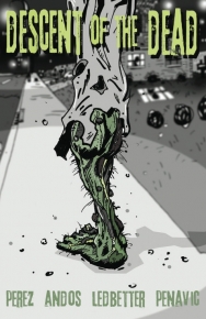 If I were to just flip through this issue and not take in the story and how the art relates to it I can honestly say I might have passed on it. What a mistake that would have been. I will admit that the art style is jagged and can seem choppy at times, but when taken into how it relates to the storyline I couldn’t be more satisfied with it. A Heavy Metal style of artwork lends itself to the overall enjoyability of this book through the designs of the dead, and of a world that has never been seen by human eyes.
So I mentioned that the art really played off the story. What I meant by that was we are presented with a future that is not our own. In the reality here there are many things to be left explored. In this issue alone were treated to a new futuristic approach to skydiving which was really cool. Of course were talking the future so anything could be possible, but the way that it was taken into context here works.
[...more]
Dracula: The Company of Monsters 1 Comic Review
Posted on August 30, 2010 by DecapitatedDan
 “He’s back from the dead and starring in a new ongoing horror series from the mind of Kurt Busiek. A powerful, predatory corporation acquires a valuable asset – Dracula! They think they own him, but no one can own the Son of the Dragon. There’s a monster in their midst that puts Hannibal Lecter to shame – and he plans to gain his freedom in blood. It’s bloodsuckers vs. bloodsucker, as Busiek brings an incredibly modern spin to the Dracula mythos.“
I can’t really say that this is a bad-looking issue, because it isn’t. However nothing really stood out to me to move it up higher on my scale. The pages early on stood out a bit more as they were focused on Vlad Dracul, with some back story, but then it just seemed to dull down as we moved into present day. The cast is good from panel to panel, nice and consistent, but it all just seems to mimic the slow story. So it didn’t really grab me.
[...more]
Cthulhu Week: The Calling: Cthulhu Chronicles 1 Comic Review
Posted on August 17, 2010 by DecapitatedDan
 This is a great looking issue. While it’s not rich in detail, the character designs have a great look and feel to them. They are nice and consistent from panel to panel, and there are even some great details in the backgrounds. The colors work well to showcase the mood and even help get the fear flowing with the gruesome images. Overall a great looking issue.
The story is by far the selling point on this issue. I can’t go too deep into it, but how freaking scary is that ending! So the start of the story had me a little confused, but as it went on I start to get a good feel for it. Nice character building throughout, you get a good sense of most of the cast. But all of that is just on hold when you reach that final page.
[...more]
Death of Dracula No. 1 Comic Review
Posted on July 29, 2010 by DecapitatedDan
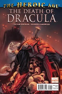 “He is the legendary Lord of the Vampires. Dracula. Who would dare attempt to overthrow him? Only Dracula’s son Xarus, a ruthless and clever upstart with the bold ambition to unite all the world’s vampire sects under one flag. But Xarus’s older brother Janus isn’t sure he likes the idea of a new regime and seeks allies to oppose Xarus. The ultimate battle to control Earth’s Creatures of the Night unfolds, with the future of the vampire race and possibly the Marvel Universe at stake.“
I wasn’t super blown away by the artwork in this story. However it was strong enough for me not to hate it. When it came to character designs, I don’t know why Dracula was changed at all. Hell he looked like he was one of the Voltron bad guys. Sure it would have been strange to see all these other cool vampires and then some dude in a cape, so I will give them that, but why not just update him to look like he is the most intriguing looking man in the room. Almost like a president.
[...more]
Rombies Issue 0 Comic Review
Posted on July 19, 2010 by DecapitatedDan
 “Rome wasn’t built in a day… but it may crumble in one. Titans battle in the arena. A thumb turns down. A sword comes down. A dead man… stands up? Racing through dark, narrow tunnels beneath the Colosseum, two heroes and a child join together to escape their pursuers. Pursuers who were once men. Hungry men. Undead men. Rombies. Friends, Romans, Countrymen… Lend me your brains!“
Have you ever picked up a book where you knew the tone of the story just from the art? Well that is what you have here. A beautifully done issue, that the art really depicts what is going on in the story. Gore-geous looking zombies and nice crisp panels page after page.
[...more]
Crossed: Family Values No 1 Review
Posted on June 8, 2010 by DecapitatedDan
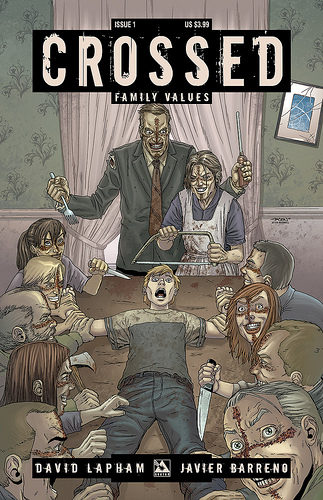 “Nothing is sacred as Crossed returns! The biggest hit horror series of the year returns with an all-new six-issue series written by David (Stray Bullets) Lapham! Set right at the start of the Crossed outbreak, this epic tale of depravity promises to shock and disturb you with even more intensity than the first series! The Pratt family lived a idyllic life on a horse ranch in North Carolina. A few generations of family working, living, and learning together. But not all things should be shared with, nor done to, other human beings. Much less your own family. Some men are just born evil, some men are turned Crossed. But which is worse? Imagine, for a moment, the worst crimes against humanity.
[...more]
